Previously, the color of any equipment was approximately the same – gray packages, black phones, beige computers and keyboards. But then something has changed … In this article, the head of the product at Yandex Factory Andrei Arzhakov will explain at what point the digital technique began to release “fashionably looking”, what psychological and marketing tricks make us want iPhone in titanium-synnaya and Marshal’s headphones in brown colors, and what colors in digital devices will be the main ones in the nearby future.
From gray to bright: color evolution in the world of technology
For a long time, the color in technology remained in the background – as if the devices had no right to look different, except strictly and functionally. But the world has changed. Today, gadgets in shades of lavender, lime or peach are no longer uncommon, and sometimes the color affects the decision to buy no less than the characteristics. We tell how technologies ceased to be shy about bright colors.
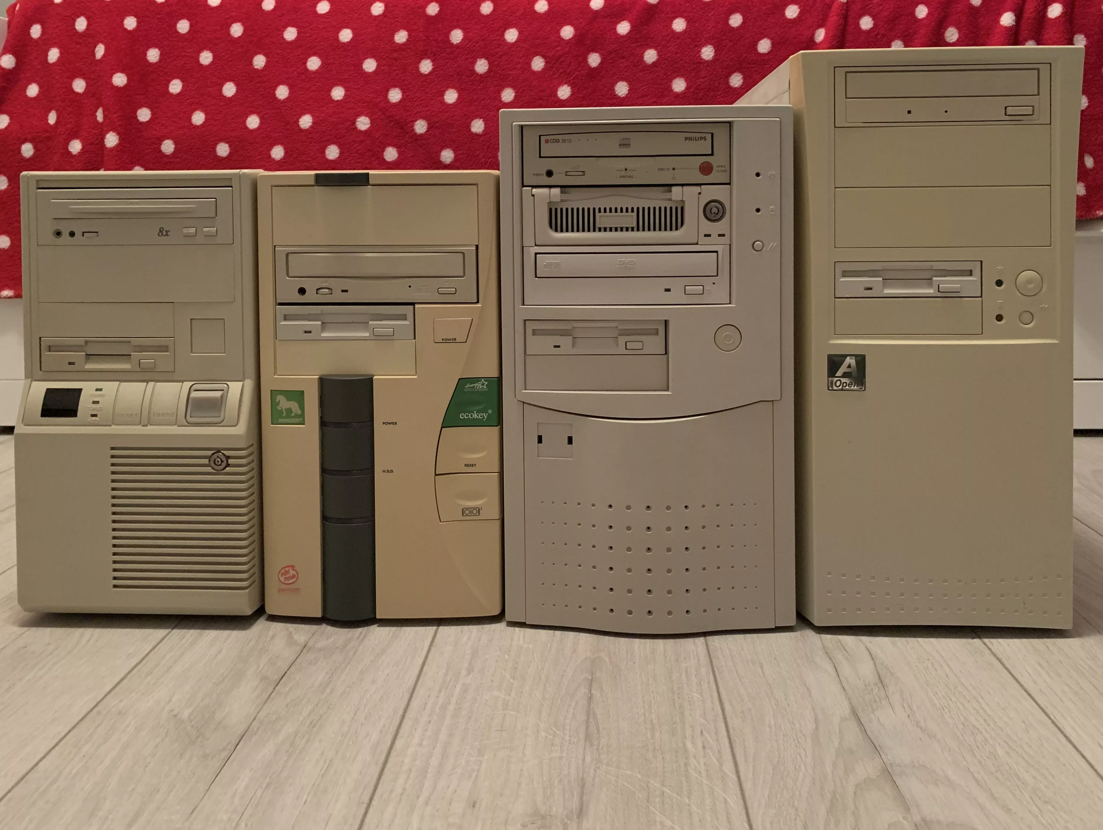
Color is not the most obvious characteristic for the device. For many decades, he was simply not taken into account. Engineers designed computers, telephones, household electronics with a sight to functionality: reliability, compactness, service life and standardization were more important. The shades of the case were selected according to the residual principle – gray, black, beige. Such colors do not glance, do not get dirty, do not require additional costs and look like “technically correct.” Bright shades were perceived for a long time as inappropriate – visually “noisy” and as if devoid of seriousness. They were allowed only in devices for children – rather as a forced measure than as a meaningful element of design. But the technique has changed – and with it the attitude towards it has changed. The devices are now not purely utilitarian, they are part of everyday life, environment, style. In this context, the color is no longer a neutral detail, but a factor of recognition, a way of expression and an occasion to choose. To understand how he appeared in technology, we recall the time when they simply did not think about color.
How gray has become the standard: functionality and pragmatism
In the middle of the 20th century, engineers formed the visual appearance of equipment, designing devices for industry, army and scientific centers. Then no one thought about how they would look in the living room or on the desktop. The main thing is reliability, ease of maintenance and unification. Gray, beige, black – these colors were as practical as possible: they did not glance, hid dust and easily combined with any environment.
Wikipedia
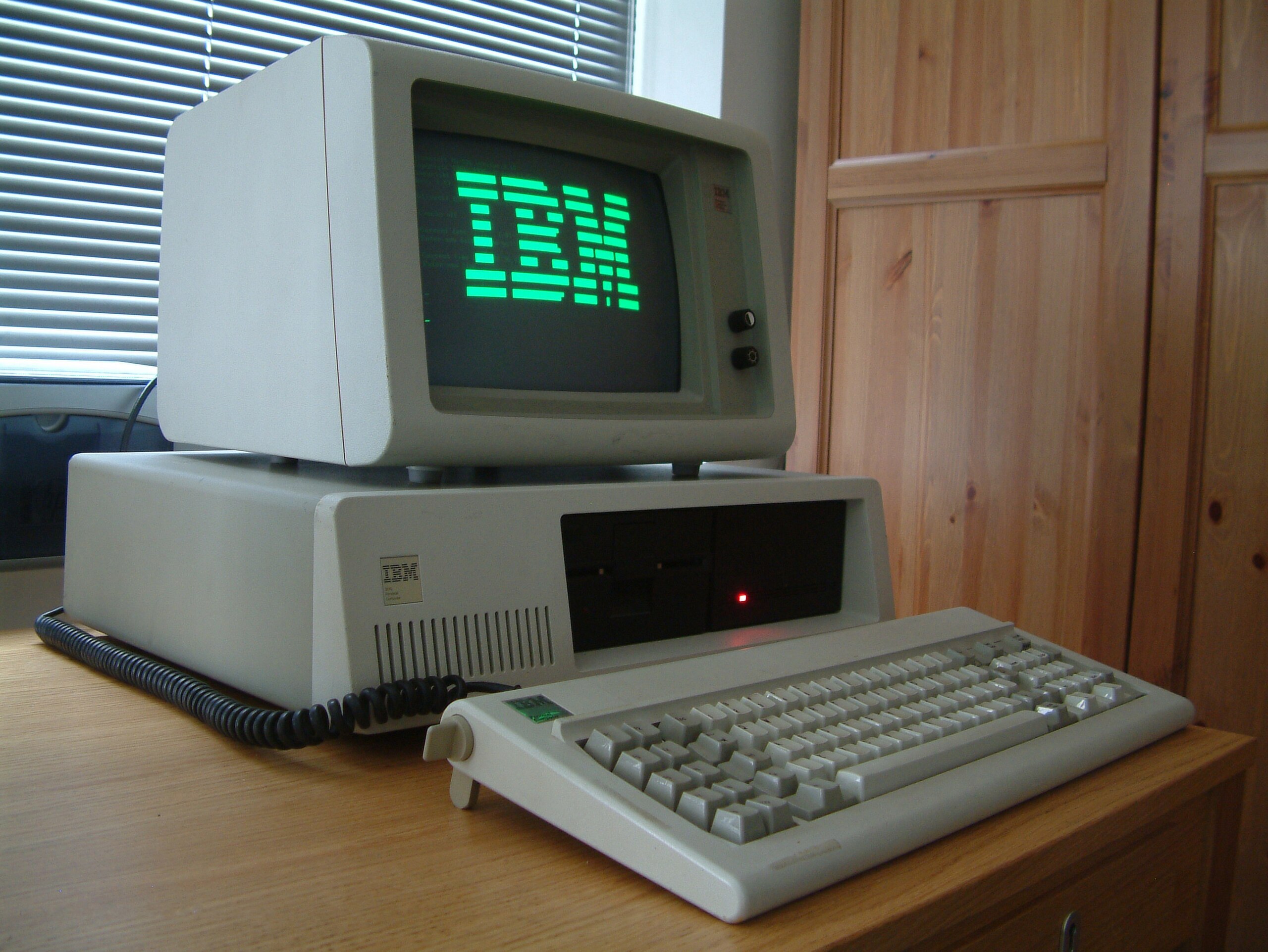
In the 1970-1990s, when computers began to penetrate the offices, the utilitarian approach only intensified. IBM PC beige housings, straight lines and minimum decor have become the standard. The technique was assigned a modest role: to work and not attract excess attention. One of those who determined the language of the industrial design of that time was Diter Rams – designer Braun, whose philosophy “Less, But Better” was reflected not only on household appliances, but also on the approach to electronics as a whole. Later, Apple inspired his ideas: the first IPod and IMAC models retained the same simplicity of forms, neutral colors and emphasized functionality.
First turn: Technique as an accessory
The whole first wave of personal computers united one thing: they “tried” to look as modestly as possible. But by the end of the 90s, the technique increasingly fell into the house-and they began to look at it differently.
Apple was one of the first to feel that the device could not only work, but “like”. In 1984, the company introduced Apple IIC – a compact computer in a light building, developed together with the designer studio Frog Design. He looked neat and “homely”, like a thing that he wants to leave in sight, and not hide in a closet.
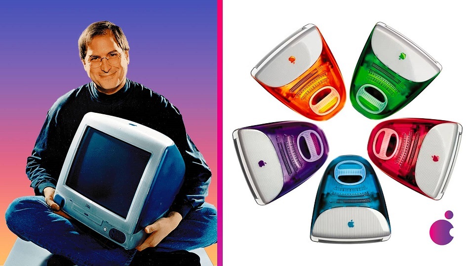
In 1998, Apple released IMAC G3 – a computer that could not be confused with nothing: a translucent case, rounded shapes and colors with names like Bondi Blue, Strawberry and Lime. The device for the first time looked so that I wanted to choose for himself, under the mood and space.
Amd.news
The phones have changed behind computers. Models like Nokia 5110 (1998), and then Nokia 3210, 3310, could be “changing” with the help of replaceable panels – on one day – on green, on the other – in silver. The color no longer seemed rare and strange-it became part of the daily choice. The technique gradually regained its character.

Nokia
Color in everyday electronics
Today, color is perceived as a natural element of the design of the technique. He expresses style, allows you to emphasize the brand belonging and make a choice a little more personal. Modern devices in almost all categories have become more diverse visually, and this is no longer a trend – this is a new standard.
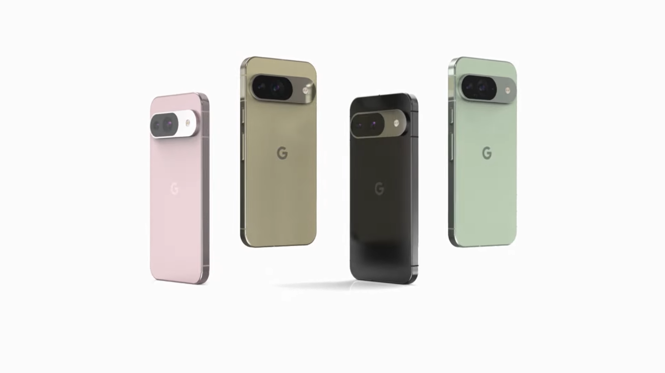
The flagship models of smartphones now go out in a whole line of shades: not just black and white, but smoky-blue, coral, mint, sand. Google Pixel 9 has a pale pink, light green, milky white and deep black. Samsung Galaxy S25 is available in ice blue, mint, dark blue and silver-gray colors, and on the official website-also in pink gold, coral red and dark blue. Brends like Vivo and Realme go further – they use gradients, mirror buildings, glossy textures.
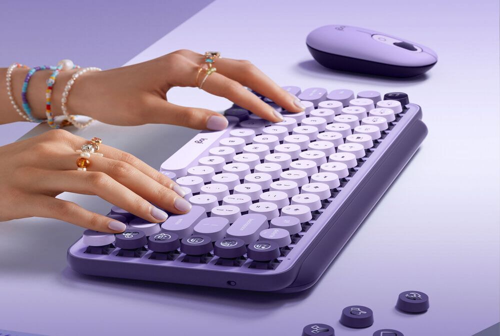
The color also picks up the periphery. Logitech and Corsair have a line of keyboards, mice and rugs in soft non-aggressive shades: gray-beige, lavender, green. Increasingly, people select the equipment so that the workspace looks like visually holistic – not only functional, but also aesthetic.
Logitech
Even charging cables have ceased to be that “lies somewhere in the corner.” Now this is a noticeable element: it gets into the frame, combines with technology or contrasts with it. Brends like Commo, Anker, National Union produce chargen cables and adapters in shades from soft cocoa and sage to saturated turquoise and yellow. For example, in Commo in the Jelly and Range line, you can find calm colors for the interior and bright – to the mood.
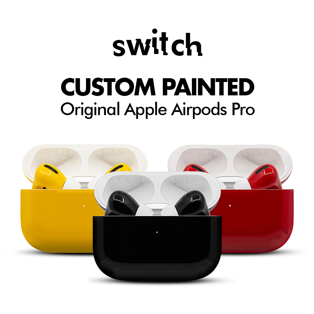
The culture of customization develops in parallel. In 2024, the studio was gained, which manually paint AirPods, draw up gamepads for Xbox and PlayStation, produce interchangeable lids and kekaps for keyboards. Caste became a way not so much to stand out as to fit the equipment into its own visual coordinate system.
Axiomtelecom
The color reached large household appliances. Refrigerators, washing machines, coffee machines no longer hide behind furniture. LG, Samsung and Smeg release models in pastel and matte tones: dusty blue, ice blue, warm gray. The color here is not an emphasis, but a way to fit the device into space.
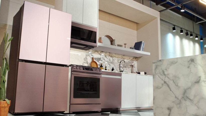
Samsung
If before the color was an exception, now it is a base. He is not always striking, but makes the technique recognizable, understandable and slightly more “his”.
Color as part of the identical you are a brand
For brands, color is more than the appearance of the device. He is a slave It is diving as a visual anchor: it helps to find out the product faster, sets an emotional tone and signals the position of the brand in the market. When almost all devices became similar externally and close in characteristics, it is the color that helps to differ. Companies repeat it in packaging, interfaces and advertising materials to enhance recognition. One accurate shade sometimes connects a person with a brand stronger than a logo. Sometimes the color becomes a constant part of the identity, and sometimes used as an emphasis, dedicated to an event or idea.
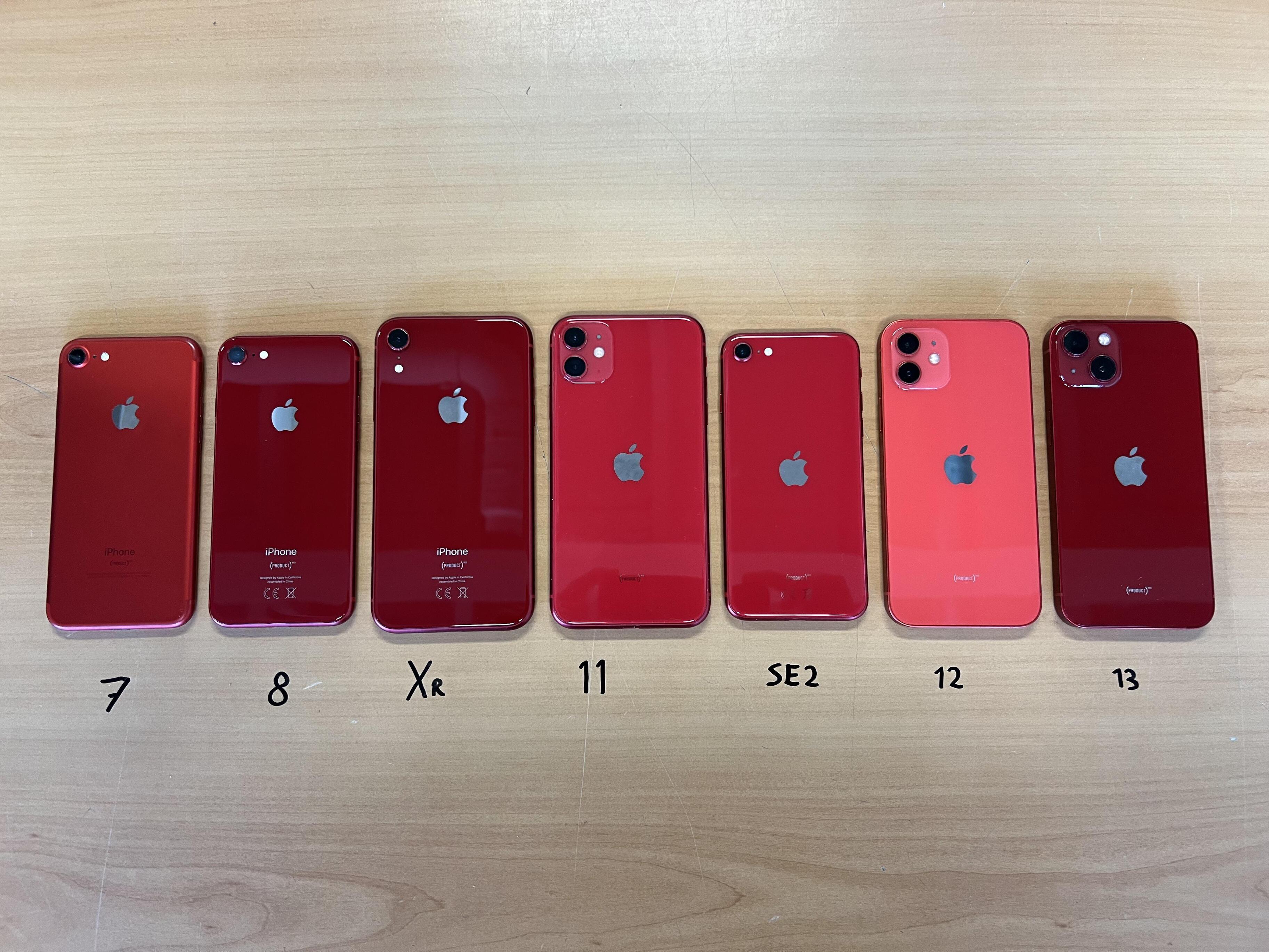
So, Apple produced the red version of the iPhone as part of a charity initiative (Product) Red. It was not just a bright smartphone, but a way to join the campaign and show a position. The color in this case worked not only for recognition, but also for a value signal. Motorola, in turn, collaborates with Pantone, releasing smartphones in the “color of the year”. This works at once at several levels: it enhances the connection with the fashion and design industry, creates an additional information water and gives the consumer the feeling that he buys not just equipment, but an actual visual object.
Sony focuses on emotions. In the Dualsense line, controllers have colors like “galactic purple” and “volcanic red” – they immediately set the mood, add the character of the device and give a choice by sensation, and not just according to characteristics. Huawei in a series of laptops Matebook X actively uses rich, but electoral colors – such as Deep Green and Frost Silver. The color of the case is repeated in the screensaver adapted by the interface and even in the promotion. All this creates an integral experience in which the technique looks and feels as a “thing with character”. Even for brands with a minimalistic design, the color remains an important marker.

Huawei
Bose, for example, has shades of housing and packaging are never random – they fit into the premium image of the brand: restraint, severity, attention to details.
The color also works as an audience separator. Brands set a different palette for different segments: the teenage ruler is bright, basic – neutral, premium – deep and muffled. This is a visual navigation that immediately tells for whom the product has been created and why.
Psychology of color: why do we choose what we choose
Even if in the store we first look at the characteristics, the decision is often made by our eyes – the very moment when one option simply seems closer, clearer, “your own”. Color gives a sensation. It can be bright – to stand out, or neutral – to fit into space. For some, it is important that the laptop does not knock out of the interior. For others – so that the smartphone cheers up in the morning. We do not always formulate it out loud, but in the end we choose exactly what visually coincides with us.
There is another level – emotional. People often choose association technique. One person takes a lilac smartphone because it was the color of his first Nokia. Another – because he is “not like everyone else.” The color works like an anchor of memory or a mood marker. Sometimes a person chooses green simply because, against the background of winter, I want summer.
This choice is increasingly not in vacuum, but in a visual context. People think with a picture: how the gadget will look on the desktop, in the interior, how it will look in the photo on social networks. The unpacking of technology is almost a genre. Photo “Setapa” – a visual business card. And the color here works for everything at once: on the mood, and on recognition, and to want to put the device in a prominent place. Color can be offered as a choice, but even more important – as an emotion. Do not just “take dark gray”, but “here is the version in which you will work comfortably is convenient to wear, it’s nice to turn it on in the morning.”
Color palettes and trends of the future
The technique is no longer obliged to look like a technique. The case should no longer be black or gray – it can be warm, complex, almost interior. The muffled tones, inspired by nature and clothes, are replacing bright and glossy buildings. The color palette becomes calmer, deeper and “lively”.
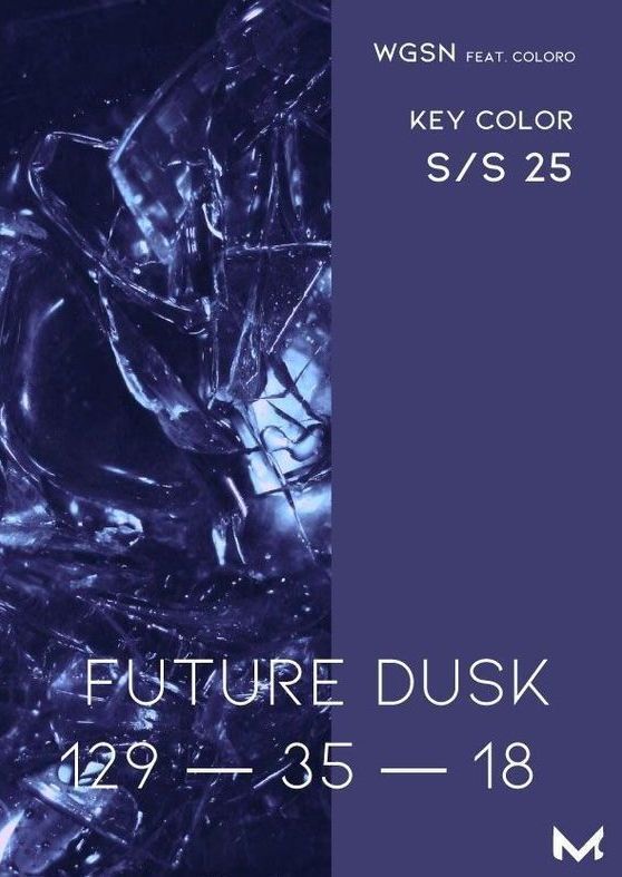
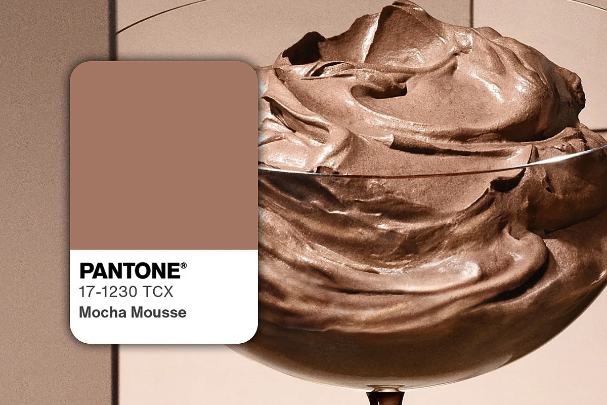
This year, two key shade immediately set the tone: Pantone Mocha Mousse is a warm caramel-brown, and Future Dusk from WGSN-blue-violet, like the sky before sunset. The first is about comfort and bodily, the second is about a feeling of depth, but without gloomy. These shades are already beginning to influence the visual language of technology: manufacturers are increasingly moving away from the usual palette and experiment with colors that are closer to the interior, clothing and even cosmetics. Against the background of neutral space, warm, complex, but soft tones are especially in demand – they do not tire the eye and fit better into the daily environment.
Design-mate.ru
The main trend of the future is not a specific shade, but an attitude. Technique is no longer a neutral object, but a thing with which you want to match. And the color is the first way to feel it. Do not stand out, but integrate. Do not hit, but coincide.


