For a long time, electronics were strict and monotonous – gray, beige and black buildings were considered the norm. Such colors were chosen because of practicality: they did not glance, did not get dirty and approached any environment. But with the development of technology and changing the role of gadgets in life, the color has ceased to be a random detail. Today, a smartphone or laptop can be bright, and the choice of shade is often more important than characteristics. The head of the product at Yandex Factory Andrei Arzhakov told how this transition occurred, why brands are betting on color and what shades will be in the trend.
In the middle of the last century, the equipment was designed for industry and the army, so the appearance did not matter. The main thing was the convenience of maintenance and reliability, and the color was selected from the most neutral. Even in the 1970-1990s, when computers began to appear in offices, the approach almost did not change: IBM beige housings, a minimum of decor and standard forms. The color was considered excess “visual load” and was allowed only in children’s devices.
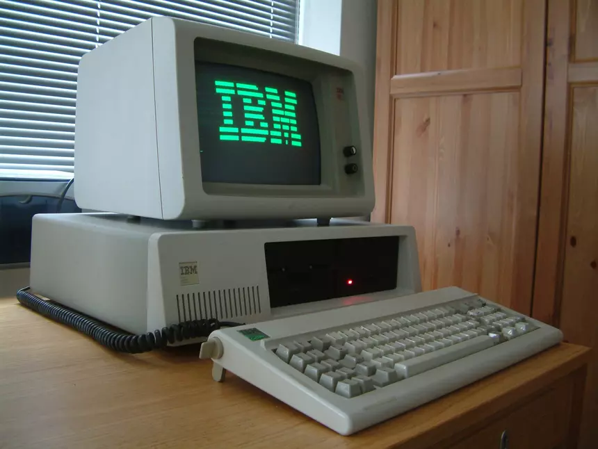
Wikipedia
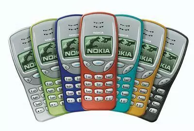
The fracture occurred in the late 90s, when the technique began to be considered as an element of the house, and not just as a tool. Apple was one of the first to pay attention to the aesthetic side of the question. The appearance of IMAC G3 in bright translucent cases showed that the computer can be individual. Phones like Nokia 5110 and 3310 with colored interchangeable panels fixed this trend, and the color ceased to be perceived as something unusual.
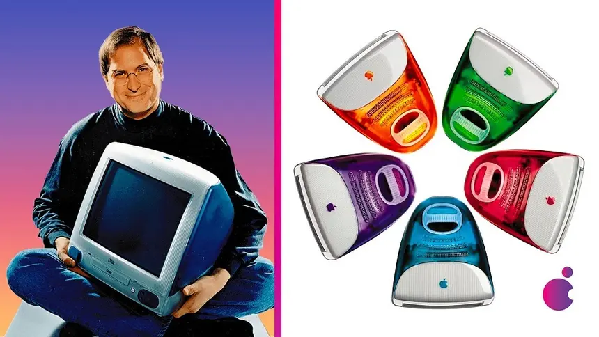
Amd.news
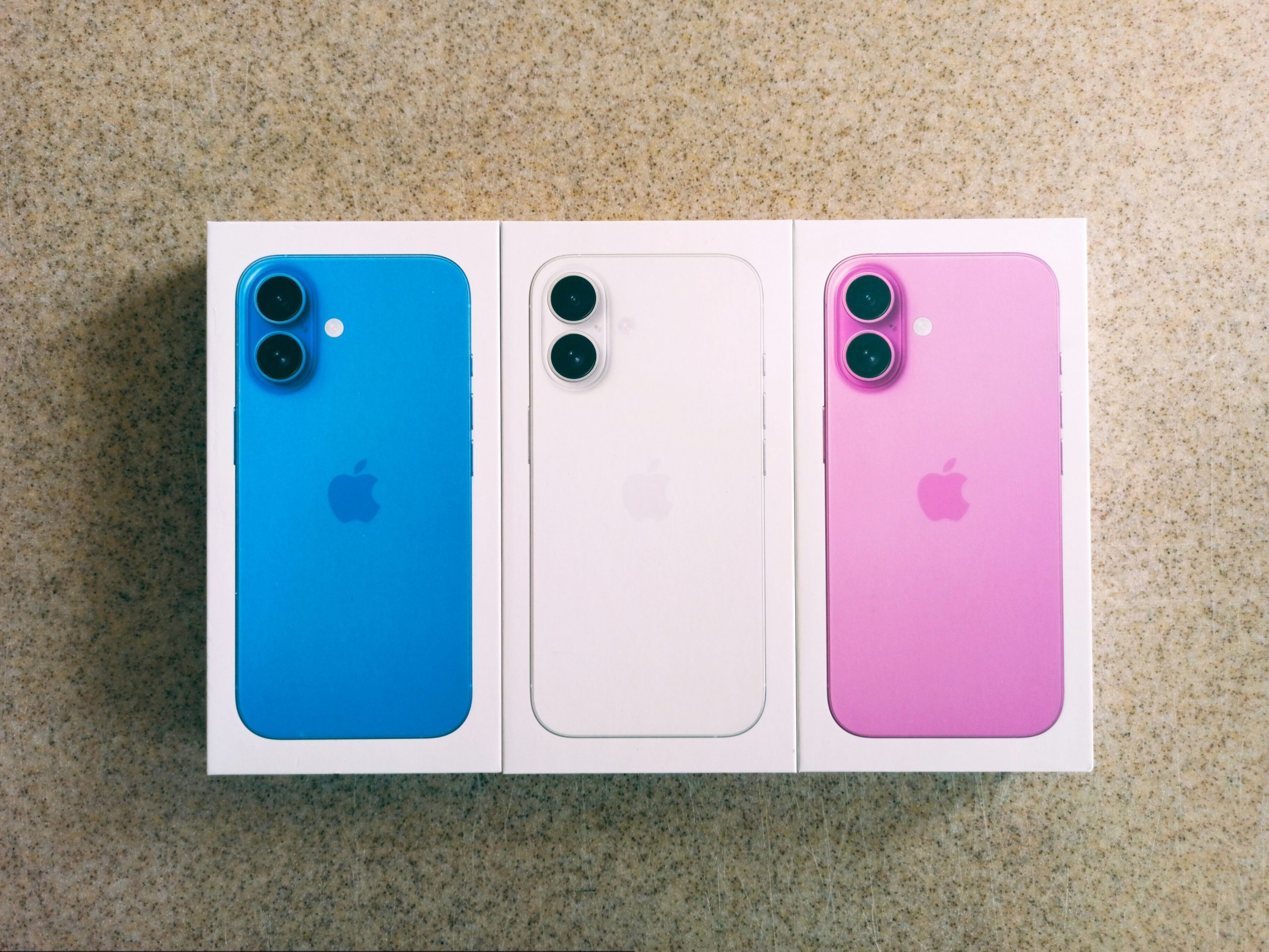
Today, a variety of palette has become a standard for smartphones, laptops and accessories. Google, Samsung, Vivo and other manufacturers offer whole lines of shades-from pale pink and mint to deep blue and coral. At the same time, the color diversity affected not only the devices themselves, but also the periphery: keyboards, mice, charger cables and even household appliances. Increasingly, buyers select equipment for the interior or create a visually holistic workplace.
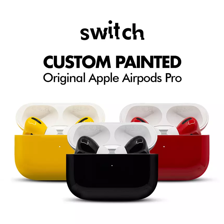
Castomization has also become a noticeable part of the market. In recent years, studios have appeared that manually paint Airpods, draw up gamepads and produce interchangeable panels for laptops and keyboards. This approach allows you to enter the device in the personal style and make it unique, not limited to the factory palette.
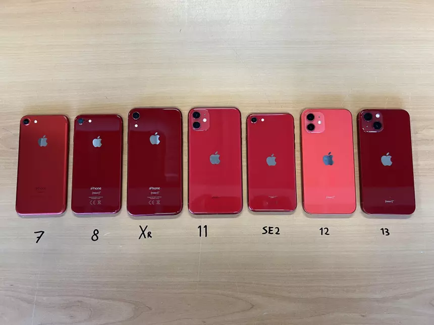
The color has become a tool of branded identity. Companies use it for recognition, emotional impact and positioning. For example, the red version of the iPhone as part of the initiative (Product) Red was not just a color option, but a way to support a charity project. Motorola collaborates with Pantone, offering smartphones in the “color of the year”, and Sony uses bright shades for gamepads to cause a certain mood.
Psychology plays an important role. People often choose the technique for associations: memories of the first phone, the desire to stand out or, conversely, fit through the environment. Color causes emotions, affects perception and helps to “make friends” with the device. All this intensifies in the era of visual social networks, where the appearance of the gadget becomes part of the image.
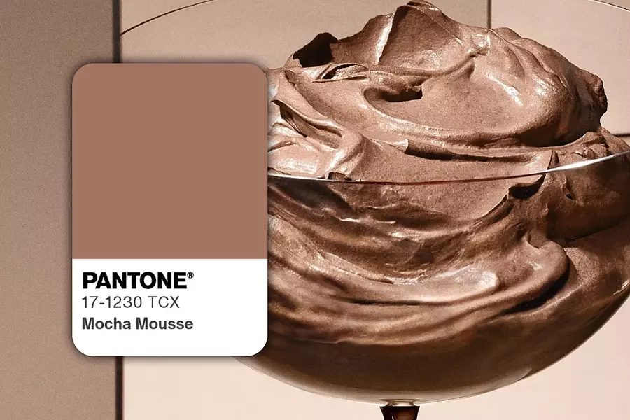
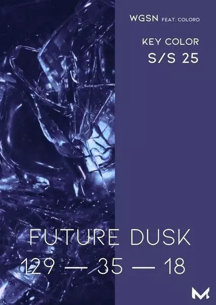
Now the trend is more calm and complex shades close to interior and natural palette. Among the noticeable colors of the year are the warm caramel mocha mousse and the blue-violet future dusk. The first creates a feeling of comfort, the second – depth and atmosphere. Manufacturers are increasingly moving away from glossy bright buildings in favor of soft tones that do not tire their eyes and look organically in an everyday environment.
